Alternative Typefaces
by Christoph KoeberlinSick of Helvetica? Sick of Gotham? The professor always recommends Rotis? Typefacts helps! Here I show you the best alternatives to old-established and inflationary used fonts:
“Helvetica is like toast. It tastes like nothing, but you can put anything on it.”
Helvetica
The classic par excellence, seen everywhere, known to everyone.


See also:
Adesso, Akkurat, Aktiv Grotesk, Akzidenz Grotesk Alright Sans Armitage, Ascender Sans, Atlas Grotesk, Balboa, Basic Commercial, Chalet Book, Classic Grotesque, Corporate S, Dada Grotesk, Dagny, Dane, Doctrine, Embarcadero, Encore Sans. Etica, Executive, Fakt, Figgins Sans, Flama, Folio, Founders Grotesk, Galaxie Polaris, Gedau Gothic, Gira Sans, Gothic 725, Grot10, Grotesque 6, Heldustry, Imago, Knockout, Korolev, Maison Neue, Malmö Sans, Maple, Maquette, Maxima, Monotype Grotesque, Neue Haas Grotesk, Neutral, Neuzeit S, New Rail Alphabet, Paralucent, Plan Grotesque, Post Grotesk, Preface, Rational, Recta, Runda, Schulbuch, Sixta, Standard, Substance, Supria Sans, Synthese, T-Star, Theinhardt, Titling Gothic, Trilogy Sans, Trilon, Trivia Grotesk, Univers, Urban Grotesk, Venus, Vonness
Gotham
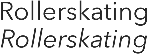
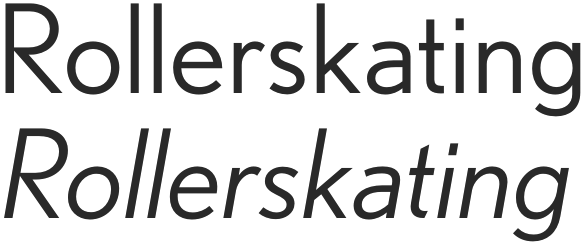
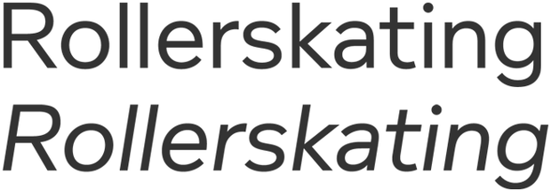
“Helvetica of The Aughts” – At the latest since Barack Obama made it his house font, the most widely used sans serif.


See also:
Apertura, Avenir, Boing, Brandon Grotesque, Burin Sans, Carisma Gothic, Clan, Colfax, Cytia, Dessau, DIN Neuzeit Grotesk, Eagle, Effra, Elliot, Erbar, Fenomen Sans, Futura, Gibson, Houschka, Interstate, Journal Sans New, Metric, Neutraface, Neuzeit Grotesk, Neuzeit S, Nobel DTL, Proxima Nova, Regular, Remo, Soleil, Sonar, Super Grotesk, Superla, Sweet Sans, Telefon, Zeppeli
Gill Sans


See also:
Agenda, Astoria Sans, Berling Nova Sans, Camphor, Diet, Documenta Sans, Edward, English Grotesque, Equip, Flex, Freight Sans, Fresco Sans, Granby, Houschka, John Sans, Johnston, Karbon, Keep Calm, Legacy Sans, Legato, London, Milo, Ministry, Mr Eaves Sans, Mundo Sans, Nexus Sans, Novel Sans, Quire Sans, Relato Sans, Rowton Sans, Scala Sans, Solitaire, Sterling, Supra, Teaspoon, Today, Velino Sans, Whitney, Yoga Sans
The folks at FontShop have also created a “FontList” of their Gill alternatives. Questioning Gill Sans by Stephen Coles (Typographica).
Garamond
As with most old typefaces, there is no one Garamond, but many different interpretations. Any original that is assumed to be by Claude Garamont offers a great deal of room for interpretation, and on top of that, not every type designer starts from the same original. I have chosen Stempel Garamond as a reference, but below I list a lot of other Garamond interpretations as well as alternatives.


See also:
Agmena, Andron, Anziano, Augereau, Dolly, Eason, Eason, Ergilo, Espinosa Nova, Freya, Galliard, Harfang, Jannon STF, Laurentian, Le Monde Livre, Lexicon, Livory, Lyon, Maiola, Malabar, Minion, Novel, Old Claude, Portrait, Poynter, Quadraat, Relato, Requiem, Sirba, Trinité, Trump Mediaeval, Van den Keere, Vendetta, Verdigris
Garamonds until you drop:
1530 Garamond, Adobe Garamond, American Garamond, Classical Garamond, Elegant Garamond, FB Garamond, Garamond (Ludlow), Garamond Premier, Garamond SB, Garamond Simoncini, Garamont Amsterdam, Italian Garamond, ITC Garamond, LTC Garamont, Monotype Garamond, Original Garamond, Sabon, Sabon Next, Stempel Garamond, Typoart Garamond, URW Garamond
The folks at FontShop have also created an overview of some Garamond variants.
FF Dax
FF Dax is considered a pioneer of spurless writing and represents the entire genre here.


See also:
Aeonis, Akko, Aller Sans, Anca, Beau Sans, Bruum, Co, Cocon, Conto, Daxline, Generis Simple, Isonorm, Kava, Maven, Max, Mic 32, Neo Tech, Noa, Phoenica, Rehn, Ribera, Rubrik,Sari, Satura, Schmalhans, Signa, Ubuntu Sans, Veto, Xenois Sans
Univers


See also:
Akkurat, Aktiv Grotesk, Akzidenz Grotesk, Basic Commercial, Bau, Benton Sans, Bureau Grot, Chalet Book, Corporate S, Dagny, Dane, Doctrine, Encore Sans, Executive, Fakt, Flama, Folio, Frutiger, Gedau Gothic, Graphik, Heldustry, Helvetica, Heron Sans, Imago, Knockout, Korolev, Malmö Sans, National, Neutral, Neuzeit S, Paralucent, Plan Grotesque, Rational, Runda, Suisse, Synthese, Titling Gothic
Extended sans serif families
Formally not always close to Univers, but also with a large number of widths and weights:
Akzidenz Grotesk, Ardoise, Benton Sans, Bureau Grot, Clan, Corpid, Dax, Fago, Fago, Frutiger, Good, Helvetica, Heron SansImago, Knockout, Korolev, Maxima, Plan Grotesque, Taz, TheSans, Titling Gothic, Trilogy Sans, Trilon, Trivia Grotesk, URW Grotesk, Zeppelin