Ampersand
by Christoph KoeberlinThe ampersand, also called Kaufmanns-Und and Et-sign in German, is a “particularly intimate fusion of letters” (Tschichold) of the letters »e« and »t« (Latin “et” = “and”). It first appeared as an early form in 79 A.D. and can be regarded as a favourite of type designers.
“Contemporary offerings are for the most part uninspired , solid pretzels: unmusical imitations of the treble clef.”
Robert Bringhurst reports on Christoph Plantin, who sometimes used four different Et-signs in one paragraph. At the same time, he criticizes the fact that out of the former variety of forms, today often only the “uninspired pretzel” remains.

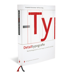
The ampersand is no longer used in the text today. In German it is officially only valid in company names, but according to Forssman/de Jong in Detailtypografie it is “also valid elsewhere where it is fun”. Mostly it is used in display sizes, which is why Bringhurst advises to choose the most beautiful form that the typeface has to offer, and sometimes also the most exciting italic in an upright context.
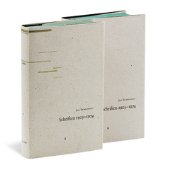
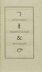
A particularly detailed treatise on the Et-sign was written by Jan Tschichold: In Formenwandlung der Et-Zeichen (Completely contained in Schriften 1925-1974 volume 2), the special form »⁊«, which originates from a Tironian note, is also explained.
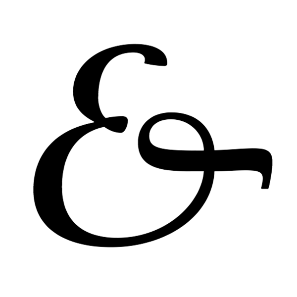
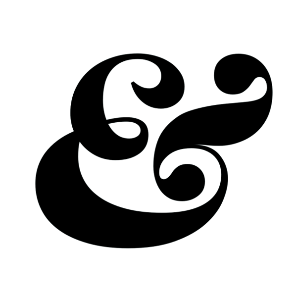
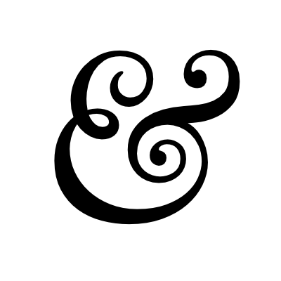
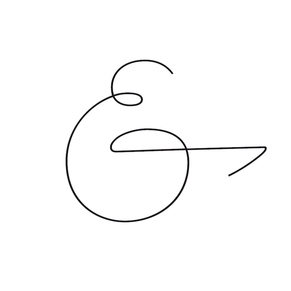
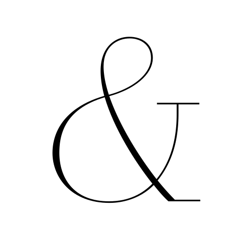
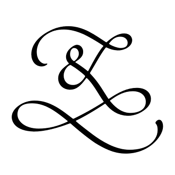
The following examples show that beautiful shapes can still be found today:


Our list continues to grow. Recommendations for further pages should not be missing here either.