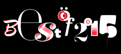
The Best Fonts of 2012
by Christoph Koeberlin
It’s the same every year: So many new fonts, and no one keeps track of them. Okay, nearly no one. Enjoy my little selection, unsorted, subjective and independent as always, bilingual (sort of) and Retina-ready for the first time!
Marian · Paul Barnes (Commercial Type)

The skeleton of the history of type
Reducing a typeface to its skeleton, in a way that keeps both its shapes and its character, is a darn hard task. Yet one single typeface wasn’t enough for Paul Barnes who did so for half of the history of type, creating skeletons of the typefaces of Austin, Baskerville, Bodoni, Fournier, Fleischmann, Garamont, Granjon & Kiš. Of course none of the historic ligatures, alternates and swashes are missing, and if that still wasn’t amazing enough, he added a hairline blackletter typeface by Hendrik van den Keere too!
FF Tisa Sans · Mitja Miklavčič (FontFont)

Leafless yew
With FF Tisa (Slovenian for “yew”), Mitja Miklavčič created one of last years’ most stunning serif typefaces, which was crying out for a sans serif counterpart from the beginning. Yet Mitja kept calm and took the time that it needed to create an adequate partner. And the result is not just adequate but independent, for unlike most sans serif equivalents, FF Tisa Sans’ friendly shapes know how to charm on its own, like in the headlines of this website.
Euclid · Emmanuel Rey (Swiss Typefaces)

Today’s geometry
Euclid isn’t a revival of a 20th century geometric sans but a true typeface of today. Emmanuel Rey’s inspirations come from a variety of different sources, such as ancient inscriptions and contemporary graffiti tags. The Bold with all its OpenType madness (countless ligatures, alternates, old style figures, unicase et al) is currently the only available style, but more weights are on the way (see exclusive preview here!).
The Harriet Series · Jackson Cavanaugh (Okay Type)

Server-crashing serifs
When Jackson Cavanaugh released his new typeface in early 2012 with its own microsite, it didn’t take long for the huge traffic to crash his server. And if you have a look at it yourself, you soon understand why: Not only is the microsite amazing but also (and especially) the typeface. Influences reach from Baskerville to Scotch Roman to the “modern” typefaces of the early 20th century, without losing its very own character. Choose from a wide range of styles for both display and body text.
OurType Stencils · Fred Smeijers, Maurice Göldner, Pierre Pané-Farré & Thomas Thiemich (OurType)

Not your usual stencil
If “stencil” used to make you think of blocky letters on containers, cardboard or wooden boxes, then Paul Barnes already taught you better in 2010 with Dala Floda. Two years later it’s Fred Smeijers who’s on one of his favourite subjects and (together with OurType designers Maurice Göldner, Pierre Pané-Farré & Thomas Thiemich) releases a whole series of extraordinary stencil fonts, one finer than the other.
JAF Bernini Sans · Tim Ahrens (Just Another Foundry)

Thrillingly unexcited
There are introvert and extrovert typefaces. The latter ones are the ones that you immediately fall in love with or hate because their characteristics are visible at first glance. The introvert typefaces are often overlooked, but the closer you look the more fascinating they become. Such as Tim Ahrens’ Berninis, consisting of the more masculine Bernino Sans (upper part of the specimen) and the feminine Bernina Sans (lower part). In myfonts.de’s interview with Tim (in German) you soon notice that he perfectly analysed the Frutigeresque “pseudo-dynamic” sans serif genre to add a typeface that’s simply ultimate.
Thema · Nikola Djurek (Typonine)

Gapless elegance
In 2008 Nikola Djurek released Typonine Stencil, whose combination of an elegant Dutch flow and an unusual stencil effect caused a stir. So it was just a question of time for him to literally close the gaps and release the exquisite shapes in an undisturbed way. And it’s been worth the wait, for it’s hard to find a comparable sophisticated broad nib!
Rollerscript · Nick Cooke (G-Type)

Digital rollerball pen
If you know me, you know that I have a soft spot for sophisticated handwritten fonts. And if you know the reality, you know that there are still not enough of them. A few years ago, Nick Cooke added the elegant Olicana to the genre, and now he comes up with something casual. As the name implies, it is based on the rollerball pen, and apart from the dynamic flow it’s the smart OpenType technology that cares for a natural and lively hand, both in the Rough and Smooth styles.
Trivia · František Štorm (Štormtype)

A trivial superfamily
František Štorm seems to be not just a great typeface designer, but also a master of understatement by coming up with a name for his gigantic type family like that. Actually, he simply likes to clearly distinguish the three basic latin type categories sans, serif and slab. Therefore he created a superfamily consisting of a Didone with matching sans and slab variants and above all that a four-width Grotesk. Not to forget the low-contrast version of the Didone for body copy, and besides countless OpenType features Cyrillic and Greek support for all of the 94 (!) styles. Trivial!
Fort ·Jeremy Mickel (Village/MCKL)

Friendly neutrality
Jeremy Mickel’s background as a graphic designer can be quite advantageous as a typeface designer: If existing fonts aren’t quite right, he can draw one himself. In the case of Fort, Gotham might have been too round and DIN too strict. The result is a contemporary sans serif with slightly squared shoulders; neutral enough to stay discreet where necessary, yet warm and friendly to avoid being impersonal.
Honorable Mentions
Andere Best-of-Listen
Many thanks
… to all designers and foundries for the support!


