The new year isn’t that new any more, yet I don’t want to do without the established look back. Again, the focus is on overviewing all remarkable releases of the year, flavoured with some personal spotlights. Anyway, one thing has changed: For the first time, it’s not my own compilation, but a cooperation with my new Typefacts-colleagues Norman and Sven who made this list possible. In this respect it makes a turning point: The end of the old Typefacts and the beginning of a partnership that should breathe new life into the old website. I’m excited!
Acumin · Robert SlimbachAlternate Gothic · Mark van Bronkhorst, Alan Dague-Greene, David Sudweeks, Igino Marini, & Ben Kiel; Morris Fuller Benton, 1903Americane · Hannes von DöhrenAndrade New · Dino dos SantosAntenna Serif · Cyrus HighsmithAureata · Ingo PreussAutograf · Måns GrebäckBalboa Plus · Jim ParkinsonBiryani · Dan Reynolds & Mathieu Réguer
### Mallory by Tobias Frere-Jones (Frere-Jones Type)
Mallory is Tobias Frere-Jones’ first commercial release as an independent type designer. He combined sincerity with a warm, yet certain playful look and feel. A special feature is the MicroPlus version that’s optimized for very small text sizes.
Blog Script · Carolina Marando & Ale PaulBrace · Göran SöderströmBrenta · Ludwig ÜbeleBrim · Jamie ClarkeBruhn Sans · Peter Bruhn; Mastered · Rui Abreu & Göran SöderströmATF Brush · American Type Founders Collection; Robert E. Smith, 1942Buendia · César PuertasBuffalo · Donald RoosCamber · Eduardo Manso
### Trianon by Loïc Sander (Production Type)
With the splendid Trianon, Loïc Sander brings Firmin Didot’s ideas to the 21th century. With its four optical sizes, Trianon retains its elegance even in sophisticated typographic applications, while type designers get excited about the tools Loïc invented on his way.
Campaign Grotesk · Mark CanesoCapri Pro · Felix BradenCarnas · Dieter HofrichterCera · Jakob RungeCera Stencil · Jakob RungeCeremony · Joost GrootensClarendon Graphic · François RappoClone · Lasko DzurovskiConto · Nils Thomsen
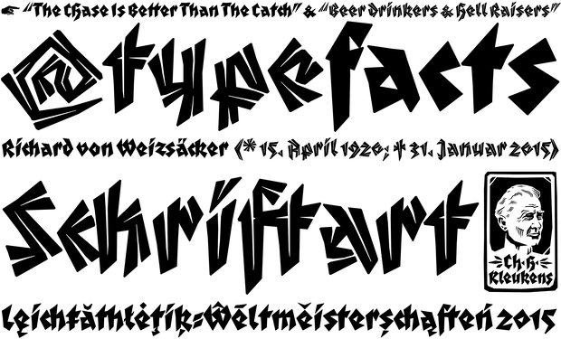
### Irrlicht by Ari Hausel (Aarhaus)
The sublime Irrlicht is Ari Hausel’s take on the Judith-Type by Christian Heinrich Kleukens. He further enriched the concept with a matching “Lichte”-style.
Cowhand · Toshi OmagariDia · Lauri Toikka & Florian SchickDouble · Alexandre Saumier Demers & Étienne Aubert BonnDruk Text Wide · Berton HasebeEbony · Veronika Burian, José ScaglioneEcho · Ross MilneEcra · Dino dos SantosEnfantine · Jean-Baptiste Levée with Yohanna My Nguyen, Loïc Sander, Yoann Minet, Ben KielEssonnes · James Todd
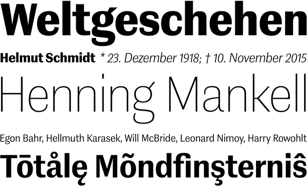
### FF Real · Erik Spiekermann & Ralph du Carrois (FontFont)
FF Real is one of the most impressive typeface releases of 2015. Designed by Erik Spiekermann and cleaned by Ralph du Carrois the typeface is rooted in early static grotesques and combines it with the typical Spiekermann twist. It’s a modern interpretation and well equipped typeface of that genre.
Eurosoft · Jérémie Hornus, Clara JullienFF Aad · Aad van DommelenFip · Rob KellerFrauen · Lucas SharpFS Brabo · Fernando MelloFS Millbank · Stuart de RozarioGill Sans Nova · George Ryan, Eric GillGodfrey · Ludwig ÜbeleGoodlife Brush · Hannes von Döhren
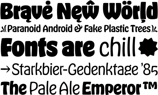
### Hobeaux by James Edmondson (OH NO Type)
How much love and life can you put into a disdained typeface? James Edmondson’s careful interpretation of Morris Fuller Benton’s classic will surprise you: You hate Hobo? You’ll love Hobeaux!
Granville · Jean-Baptiste Levée with help · Mathieu RéguerGratitude Script · Kathy Milici & Ale PaulGT Cinetype · Mauro Paolozzi & Rafael KochHalifax · Dieter HofrichterHaptic Script · Henning SkibbeHeimat Display · Christoph DunstInes · Dino dos SantosInfini · Sandrine NugueIngra · Ermin Međedović
### Contemporary Sans by Ludwig Übele (Ludwig Type)
Ludwig is one of the most talented type designers in Germany, and you might as well take any other of his 2015 releases. We chose Contemporary Sans, which shows that a Sans Serif with contrast doesn’t have to look like it was made for fashion magazines.
Joanna Nova · Ben Jones, Eric GillJosef K · Julia SysmäläinenJules · Dino dos Santos, Pedro LealKazimir · Ilya Ruderman, Yury OstromentskyKomet · Jan FrommKrabbesholm · Radim Peško & Tomáš CeliznaLaplace Mono · Anton KoovitLe Colonel · Sylvain EspositoLichtspielhaus Slab · Stefan Hübsch
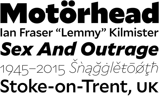
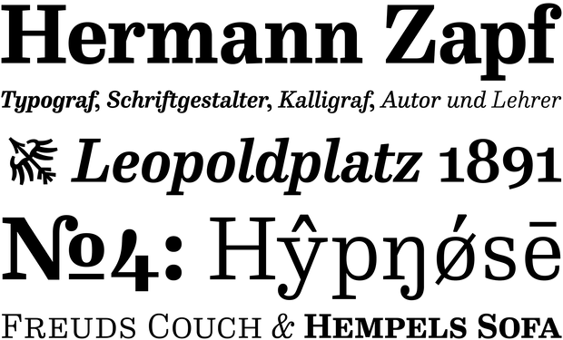
### FF Hertz · Jens Kutílek (FontFont)
Jens Kutílek’s FF Hertz with its squarish forms is influenced by Hermann Zapf’s Melior and his Mergenthaler Antiqua. The typeface references to early German topographic maps too. Its uniwidth design and character set makes it perfect for advanced typographic works.
LiebeLotte · Ulrike RauschMangan · Dieter HofrichterMartel Sans · Dan Reynolds & Mathieu RéguerMedia77 · Team’77 · André Gürtler, Christian Mengelt & Erich GschwindMenoe Grotesque · Adam KatyiMina Chic · Giuseppe Salerno & Paco GonzálezModel · Maximiliano SprovieroNB International · Stefan GandlNeue Haas Unica · Toshi Omagari; ursprünglich · Team’77
### Nitti Mostro · Pieter van Rosmalen (Bold Monday)
Nitti Mostro by Pieter van Rosmalen is an extension of the praised Nitti family. With its 18 styles, it clearly is a prime example how a chromatic typeface for the digital-age could look like. Be sure to give it a spin on its amazing microsite!
New Grotesk Square One · Henrik KubelNoe Text · Lauri Toikka & Florian SchickObjektiv · Bruno MelloObsidian · Andy ClymerPaintlay · Mika MelvasPattern · Eike DinglerPicara · Sandra CarreraProza · Jasper de WaardQuercus · František ŠtormSabre · Gareth Hague
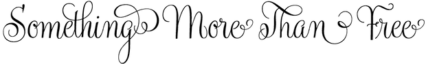
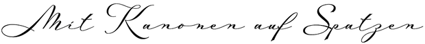
### Hollie Script · Felipe Calderón (Estudio Calderon)
Hollie Script with its companion Hollie Scripts Ornaments is a modern interpretation of mid-20th centuries’ window lettering. A rich glyph set with contextual ligatures, and alternative characters make it appear in a very nice way.
Sanomat Sans · Vincent Chan and Christian SchwartzScandia · Eric OlsonScandia Line · Eric OlsonSilva · Daniel SabinoSuisse Sign · Swiss TypefacesTelemaque FY · Jean-Baptiste MorizotTesla Slab · Nikola DjurekTremolo · Nikola DjurekTripper · Sami Kortemäki, Akiem Helmling & Bas JacobsUnica77 · Maurice Göldner, Christian Mengelt · Team’77Vito · Thomas GabrielVortice · Miguel SousaWand · Charles GibbonsWeissenhof Grotesk · Dirk Wachowiak & Stefanie SchwarzWittingau · František ŠtormVLNL Wurst · Alexandre Saumier DemersZahrah · Yoann Minet